
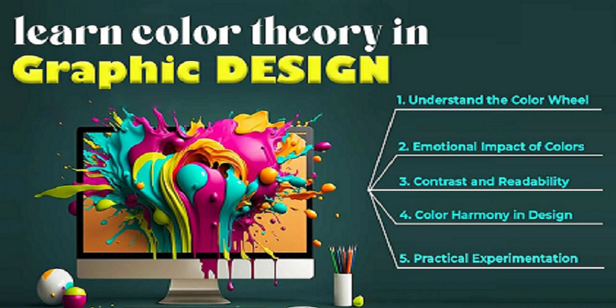
Understanding color theory is essential for every graphic designer. It influences mood, perception, and how your audience connects with your visual message. When used correctly, colors can evoke emotions and enhance brand recognition.
Start by learning the basics: primary, secondary, and tertiary colors. Then dive into color harmonies like complementary, analogous, and triadic schemes to create balanced and visually appealing designs.
Use warm colors (reds, oranges, yellows) to create energy and excitement, and cool colors (blues, greens, purples) to convey calmness and professionalism. Neutral tones are perfect for backgrounds and text readability.
Also, consider color psychology. For instance, blue is often associated with trust, while red can trigger urgency or passion. Choose palettes based on the message and target audience of your design project.
Finally, test your color choices across different devices and backgrounds. A well-crafted color palette will elevate your designs, boost engagement, and communicate your visual story more effectively.